Dr. Roberto De Luca has been a dietitian since 2008 and sees patients at his practice in Terni. Aleryc Digital Studio designed his website from scratch, starting from him and not from the industry: the sentence he keeps coming back to when explaining his work shaped the first screen, the pencil drawings he makes on his patients’ plans became the language of the whole website, the method is leafed through on a reproduction of the diary where he notes his appointments, and the ensō, the Zen circle we designed as his logo and brand mark, comes from the philosophy of the martial arts he believes in.
The website you’d expect.
You can recognise a dietitian’s website before you even read it. Green and white, fruit photographed on a light background, a tape measure, a list of diets, a few promises of kilos lost. None of these are wrong choices in themselves, but they all look alike and say little about the person you’ll meet.
Dr. De Luca doesn’t work that way. Sitting across from him are athletes and ballet dancers, pregnant women, children, older people with medical conditions, people with an eating disorder. His work starts with a conversation, and the meal plan comes after. A catalogue-style website would have betrayed exactly that, so the first question wasn’t what a dietitian should look like, but who this dietitian was.
Before drawing, listening.
The starting material was his words and his things. One sentence of his: eating disorders are the tip of the iceberg of a series of unresolved traumas. His notes on what he calls the relational diet. The diary where he notes his appointments. A first life as a veterinarian, a survival food kit for use at sea formulated with the Italian Navy, karting, motorcycles, kung fu and jiu-jitsu.
And one small detail that changed everything: on the plans he gives his patients he draws playful little pencil figures, often without lifting the point from the paper.
The roads not taken.
We didn’t get there right away. The first idea was to walk into his practice: a corridor, a door ajar, him at his desk looking up. It showed a place, not a way of thinking, and it stopped there. More emotional images followed, like a vase mended with gold, a portrait made of fruit, a childhood memory inside a cup, and more direct ones, like a scale, a pomegranate, a plate coming together.
Some were impersonal, others too philosophical. We needed an image anyone would link to the profession straight away and that could belong only to him. It was already on his sheets of paper: a pencil drawing.
The iceberg: an apple that’s only the tip.
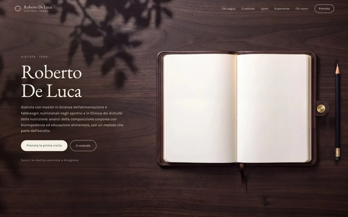
The first screen is a walnut desk seen from above, with Dr. De Luca’s diary open and a pencil resting beside it. You scroll, the view moves down onto the page and the pencil starts tracing, with no hand ever in sight: an apple, then the waterline. The apple is the tip of an iceberg. Below the surface a face and a heart appear, at the top of the page his words write themselves in pencil and then fade, watercolour fills the sea, and that blue becomes the next page, where you read his sentence.
It’s his thinking turned into a gesture: what you see is the food, but the food is only the tip. Twenty drawings were tried to get to that apple. The line follows the scroll and appears exactly where the point passes: the reader isn’t looking at an illustration, they’re bringing it to life by moving down the page.
A single line, from start to finish.
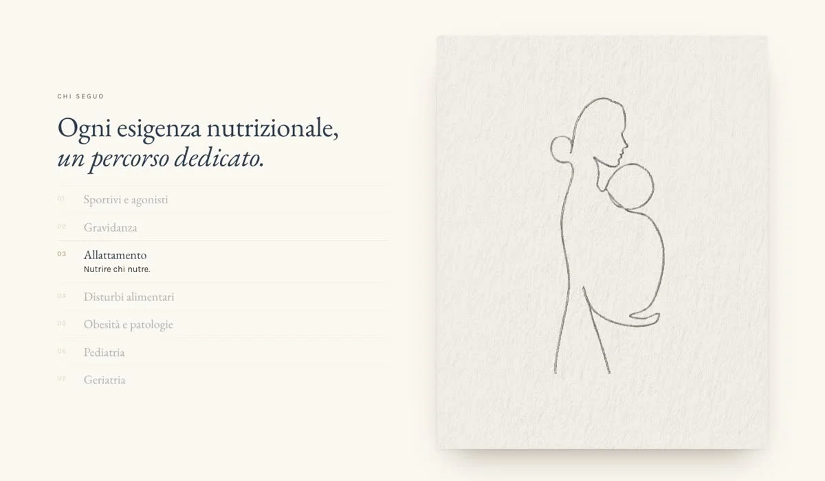
That gesture gave the whole website its rule: every drawing is in pencil, with the same line, and runs as one continuous stroke, as on Dr. De Luca’s plans. In the section on who he sees, each entry has its own sheet of rough paper: athletes and competitors, pregnancy, breastfeeding, eating disorders, obesity and medical conditions, paediatrics, geriatrics. The pencil draws as you scroll, then comes the watercolour, which can be imprecise and go over the line the way a brush does.
The subjects were chosen one by one and reworked until the profiles felt harmonious. Readers look for themselves in that list and find a pencil figure instead of a stock photo: a first taste of the care they’ll find on the page of their own plan.
You leaf through the method.
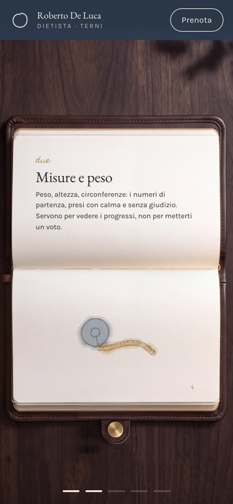
A course of care can’t be summed up in a bulleted list. That’s why the method is leafed through on the diary from the first screen, a reproduction of Dr. De Luca’s real one, where he notes his appointments: listening, measurements and weight, bioimpedance, a tailored plan, independence. One page for each step, and the page really turns, by scrolling, with the trackpad or by dragging it. The order is his: the first step is a conversation, the last is standing on your own two feet. The same diary comes back at the bottom of the website, designed for booking appointments: you choose the visit, the day and the time.
The page on bioimpedance doesn’t simplify anything and talks about resistance, reactance and phase angle, because behind the warm tone there’s a professional who measures. Right after that, on a slip of paper, the pencil writes a sentence from his notes: “Losing weight isn’t a war against food and temptation, but a search for harmony with yourself.” The signature that closes it writes itself on the spot and it’s his real one, which we took from the cover of one of his works on eating disorders.
Off the track and Mugello.
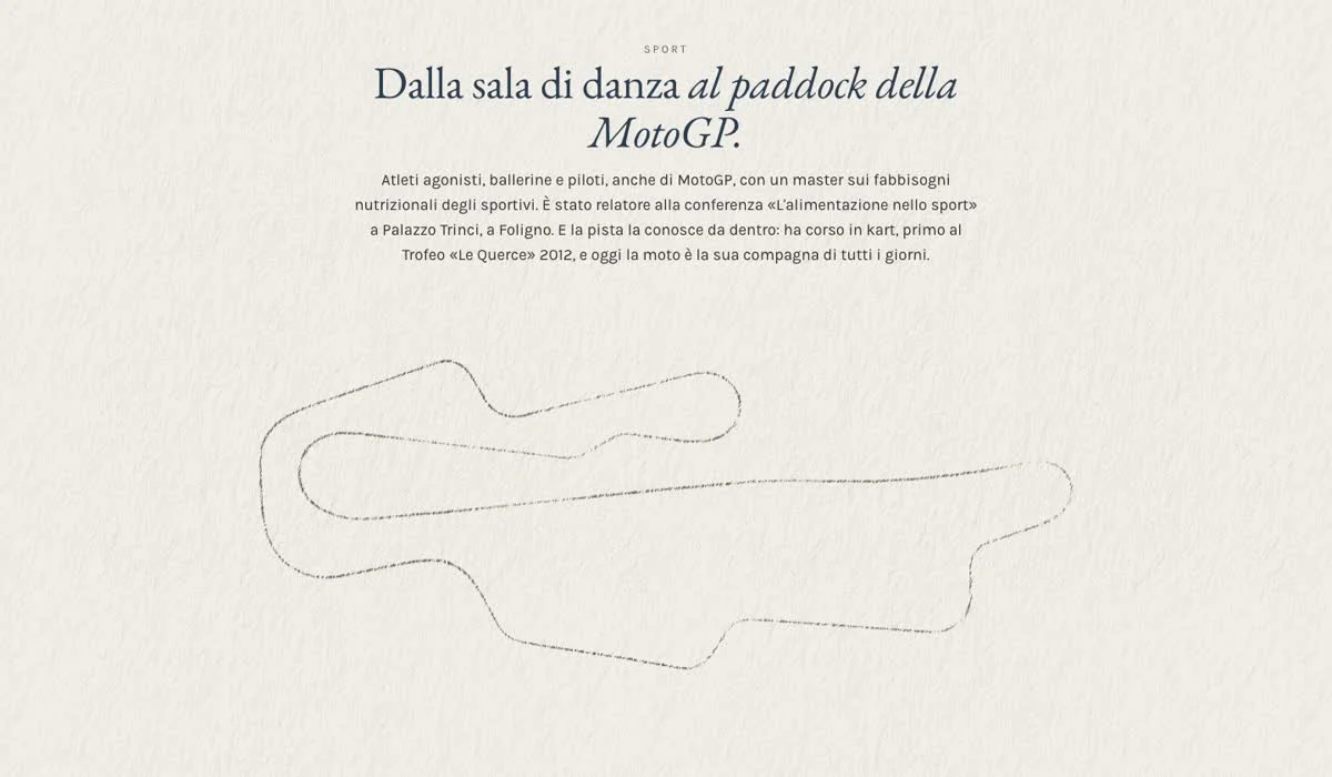
In his notes, mistakes don’t exist: “it isn’t a mistake, you’ve just run off the track”. He knows what he’s talking about, because he raced karts all the way to winning the “Le Querce” Trophy, and today his motorcycle is his everyday companion. That idea shaped the section on sport, which goes from the dance studio to the MotoGP paddock: as you scroll, the pencil traces over the Mugello circuit, taken from the real plan of the track. The message for anyone who slips up and the world of people who compete sit in the same drawing.
One circle, one gesture.
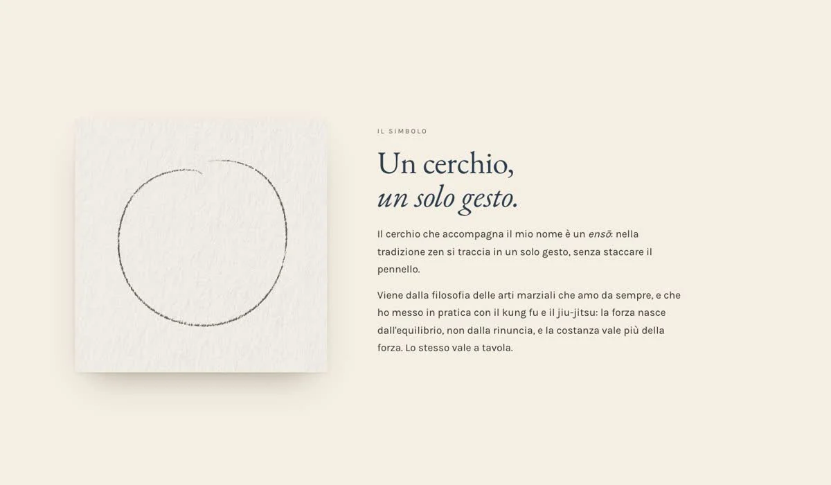
Dr. De Luca has practised kung fu and jiu-jitsu and believes deeply in the philosophy of the martial arts: strength comes from balance, not from giving things up, and consistency counts for more than force. It’s a principle he brings to the table too, and his identity grew out of it. We designed an ensō for him, the circle that in the Zen tradition is drawn in a single gesture, without lifting the brush, and made it his logo and his brand mark: the same principle as the single line, arriving by another road. On the website the symbol has a section of its own, where it draws itself in front of the reader, so anyone who sees it next to his name knows where it comes from.
Desk colours and typefaces.
Walnut and leather, paper and ivory, brass and graphite, and the slate blue that arrives with the watercolour. It’s the palette of a desk, not of a clinic, and it takes away the clinical air for people coming to talk about their relationship with food. Headlines are in EB Garamond, with the calm tone of a book, body text in Karla and notes in Homemade Apple, a handwritten script. There’s no health-green on the website and no stock fruit, and no comparison between bodies before and after.
A pace with no stopwatch.
The way the page moves is a choice too. The loading screen is blue, the same blue as the buttons, with his name and a thin bar that fills up: it lasts only as long as it has to. After that there are just five real stops: the first screen, the section on who he sees, the method, the sentence and the track. Everywhere else you scroll freely, even a single line at a time, to read at your own pace.
The same goes for the way he sees people. Before choosing a visit you read how it works, and the durations are only indicative, because in his words “you don’t travel with a stopwatch”. To anyone who lives nearby he always recommends the practice, since in his approach the in-person relationship is essential. Phone and WhatsApp lead to him: “I’m the one who answers”. The website uses no statistics or tracking systems, and for someone reading about eating disorders that too is a form of respect.
A life on one page.
His career has a page of its own, written in the first person: veterinary medicine, the degree in Dietetics in Perugia, the survival kit with the Italian Navy and the May 2008 article, the 2024 conference in Foligno with the plate he received in recognition, his work on eating disorders and obesity, his training year by year, his passions. The photos are few and carefully chosen, set in Polaroid-style frames that follow the size of each photo as it changes; documents open large so they can really be read. It’s the opposite of a CV in a list: you understand how a person came to work this way.
Every choice carries his name.
The simplest test is to take the name away and see what’s left. The iceberg is his sentence, the single line comes from his plans, the diary is the one with his appointments, off the track is his own track, the ensō comes from the martial arts he believes in, the signature is his own hand. These materials belong to one person alone, which is why the website can’t be reused for anyone else.
For someone looking for a dietitian the difference is concrete: before even picking up the phone, they’ve understood how the person they’re about to tell about their relationship with food thinks. A custom website can do that too.
Results.
You won’t find numbers on visits and bookings here. We only publish real, measured data, and we’ll add it when there is some.